To turn an article into a LinkedIn® document carousel, choose one reader outcome, rewrite the argument as a short slide sequence, and export a checked PDF. Upload the file as a document post with a descriptive title and useful caption. Keep the original article available for detail, sources, and accessible reading.
Key takeaways
- An organic document carousel is a document post that readers move through page by page.
- Adapt one argument from the article instead of shrinking every paragraph onto slides.
- Design for a small screen, then inspect the exported PDF before uploading.
- Keep sources and important qualifications close to the claims they support.
- Provide a text summary and a link to the full article for readers who need another format.
What is a LinkedIn® document carousel?
A document carousel is a multipage document shared as a post, with pages that readers can move through in sequence. In this guide, the term means an organic document post; paid carousel ads and sets of separately uploaded images are different formats.
LinkedIn®'s document upload guidance supports PDF and several office document formats. It recommends converting files to PDF where possible. A PDF gives you a practical way to prepare and check a consistent sequence before publishing.
The format suits ideas that build through steps, examples, or comparisons. It is less suitable when your main value depends on an interactive tool, a long reference table, or a detailed argument that loses accuracy when compressed.
An existing article gives you useful raw material: a clear subject, evidence, examples, and a conclusion. Your job is to decide which part deserves a visual sequence. The carousel should make sense to someone who never opens the original article.
Treat the document as a new editorial format. A slide needs to be readable in its own context and connected to the pages around it. Pasting paragraphs into a template usually preserves the article's length while losing the reading experience that made the article work.
How do you choose the article's strongest angle?
Choose the smallest complete answer that helps a specific reader do something. An article about customer interviews might contain recruitment advice, question templates, analysis methods, and consent guidance. A carousel could focus on just one task: replacing leading questions with neutral ones.
Write a one-sentence promise before opening a design tool. For example: “After reading these slides, you can rewrite an interview question that accidentally suggests the answer.” That promise tells you which material belongs and which material can stay in the article.
Identify the source article's strongest example and its most important qualification. Those two elements often matter more than a long list of tips. The example demonstrates the recommendation; the qualification prevents readers from applying it where it does not fit.
Check the article's facts again, even if it is your own work. Sources can change, a product can retire a feature, and a previously useful recommendation can become outdated. Repurposing should not quietly turn an old claim into a fresh claim without verification.
Fill in a simple extraction sheet in plain text before you design anything:
- Reader: [role, and the task they are doing]
- Problem: [what goes wrong today, in one sentence]
- Recommended action: [the change the article recommends]
- Example: [the article's strongest example]
- Exception: [when the advice needs adjusting]
- Source: [where the claim comes from]
- Next step: [one thing the reader can do after the last slide]
If the fields fail to form a coherent answer, narrow the angle before you spend time choosing colors or layouts.
How do you choose what belongs on each slide?
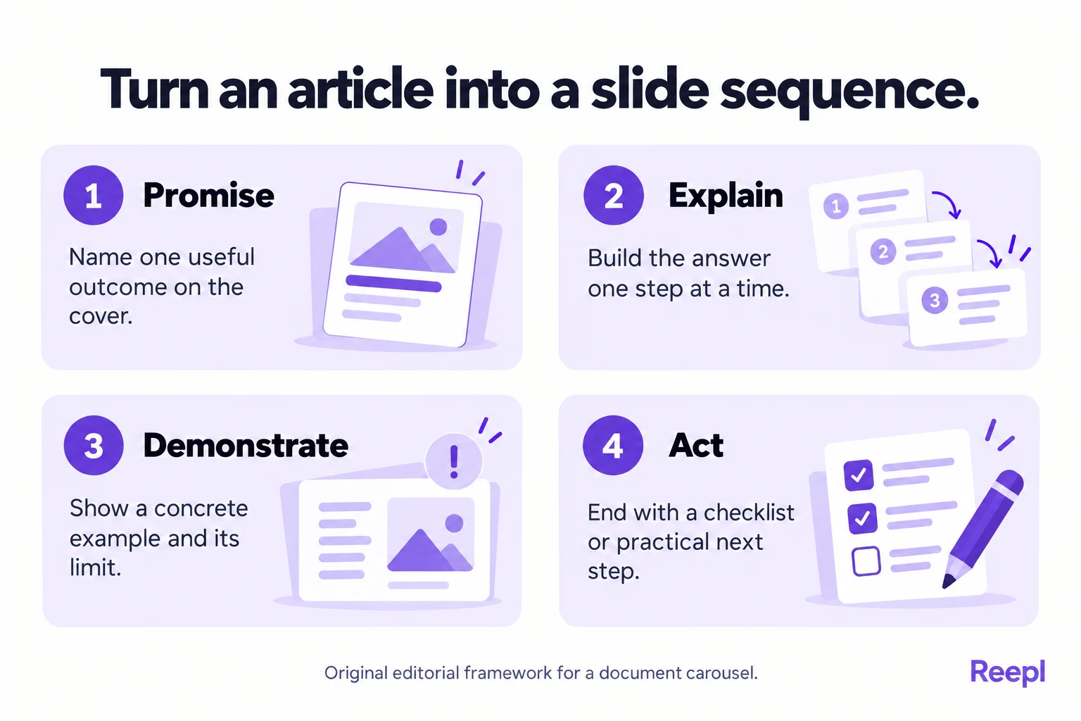
Give each slide one job in a complete argument. Start with the promise, explain the problem, show the method, demonstrate the method, and finish with an action. The sequence matters more than reaching a particular slide count.
Here is a suggested structure for an article that teaches a process. The page count is an editorial choice for this example.
| Page | Job | What the reader should understand |
|---|---|---|
| Cover | Make the promise | Who the document helps and how |
| Problem | Explain the mistake | Why the current approach fails |
| Principle | State the decision rule | What to do differently |
| Example | Demonstrate the change | What the advice looks like in practice |
| Boundary | Preserve the qualification | When the rule needs adjustment |
| Checklist | Make the answer usable | What to check before acting |
| Closing | Offer a next step | Where to find detail or apply the method |
Write the headings as a rough draft first. Read only those headings in order. If they fail to describe a logical argument, rearrange the sequence before adding body text. This catches structural problems while they are still easy to fix.
Then add the minimum explanation each heading needs. A practical starting point is a short paragraph or a few concise bullets per slide. If a page needs several caveats, consider splitting it or choosing a narrower claim.
Before (pasted): the article's whole paragraph on neutral wording, set in small type to fit the page. After (illustrative slide): the heading “Ask about what happened,” two short lines of explanation and one example question. The second version can be read at phone size and still carries the point.
Keep sources near the relevant claim, using a readable short source label and a clear reference in the article or caption. Put a qualification on the same slide as the claim it changes, instead of saving it for the final slide.
How do you make carousel slides readable and accessible?
Use large, legible text, a clear reading order, and enough contrast between the words and their background. Check the slide at the size a reader will actually see. A beautiful desktop preview can hide a document that is exhausting to read on a phone.
W3C's contrast guidance specifies a minimum contrast ratio of 4.5:1 for normal text and 3:1 for large text under that criterion. Use them as reference values for slide text.
Avoid light gray explanatory text, text placed over busy photographs, and tiny source labels. Leave space around the important point. When you need to fit more words, edit the sentence or split the page before reducing the font size.
W3C's use-of-color guidance says color should not be the only means of conveying information. For example, label examples “Leading question” and “Neutral question” instead of relying only on red and green boxes. Readers should understand the distinction even when the colors are hard to tell apart.
W3C's guidance on complex images explains why charts and diagrams need text equivalents that convey the essential information. Apply the same principle to your carousel: explain the takeaway in words and make the fuller explanation available in the article.
PDF accessibility also depends on document structure. Adobe's accessibility guidance covers checks including tags, reading order, and other document properties. A visually simple PDF can still read incorrectly with assistive technology, so run the accessibility check on the exported file itself.
What does a complete article-to-carousel example look like?
Consider an illustrative article titled “How to ask better customer interview questions.” The article includes advice about recruitment, interview structure, neutral wording, and analysis. For the carousel, we choose one narrower task: rewriting questions that invite agreement.
The example below is invented to demonstrate the editing process; it is not a customer case study. You can adapt the reasoning to a tutorial, an opinion article, or a practical checklist.
Cover: “Ask about what happened, not what sounds good.” The subtitle identifies the audience: “A question-writing checklist for customer interviews.” This gives readers a useful promise without suggesting that the document covers every part of interviewing.
Problem: “Would you use a faster reporting tool?” The explanation says the question asks for a prediction and frames speed as desirable. The point is specific enough to understand without a long introduction to research methodology.
Principle: “Ask for a recent, concrete example.” The slide suggests asking what the person did the last time they prepared a report. It explains that the aim is to understand actual behavior before proposing a solution.
Example: “Tell me about the last report you prepared. What took the most effort?” A small annotation explains how the wording leaves room for problems other than speed, such as finding data or getting approval.
Boundary: “Past behavior is useful context, not a complete product decision.” The slide explains that interviews still require careful interpretation and should be considered alongside other evidence. That prevents the carousel from overstating what one question can establish.
Checklist: “Is the question neutral? Does it ask about a real situation? Can the person disagree with your assumption?” These prompts turn the explanation into something readers can use when reviewing their own interview script.
Closing: “Choose one question in your next interview guide and rewrite it.” The caption links to the full article for recruitment and analysis guidance. The carousel has delivered its promised answer while leaving the broader material in a more suitable format.
How do you export and check the PDF?
Export the slides as one PDF, then open that exact file and inspect every page. Check the file you will upload, not only the editor preview. Export can change line breaks, fonts, image quality, and the position of elements.
Use a descriptive filename so you can distinguish the final document from earlier drafts. Keep a separate editable source file. If someone spots an error, you will need to correct the original design and produce a new export, with no guessing about which version you published.
Check the following before uploading:
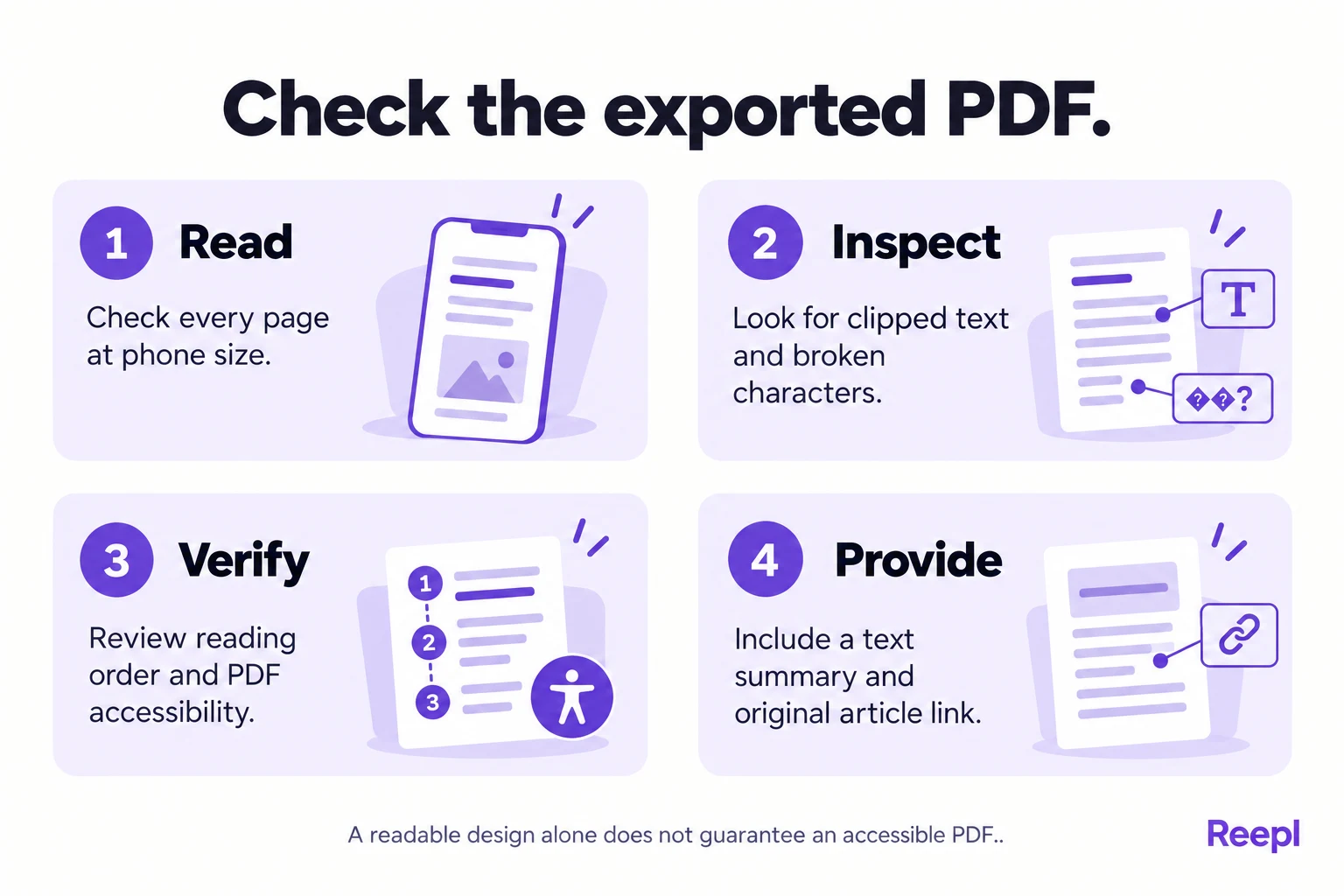
- Confirm the pages are in the intended order and use a consistent size.
- Look for clipped text, missing symbols, and unexpectedly substituted fonts.
- Read the document at phone size without zooming into every sentence.
- Test source links in the downloaded file where relevant.
- Review text selection, reading order, and accessibility checks separately.
- Confirm the caption provides a useful text summary and the original article link.
As checked in October 2026, LinkedIn®'s upload guidance sets limits of 100 MB and 300 pages. Those are technical ceilings, not sensible targets for a short educational carousel. The same guidance says document animations display as static images.
If the export fails, simplify the document and try again. Remove unnecessary high-resolution background images, confirm every page uses the same dimensions, and check the platform's current requirements. Compress carefully, because a smaller file is not helpful if its text becomes difficult to read.
How do you upload a PDF carousel to LinkedIn®?
Upload the PDF through the document option in the post composer, add a descriptive document title, and write a caption that introduces the reader's problem. The official document guidance describes the desktop flow as starting a post, opening More, and choosing Add a document.
Select the checked file, review its title, and finish the accompanying post text before publishing. Interface labels can change, so use the current document-upload instructions if your screen differs. Avoid uploading individual slide images when your intended result is a single document post.
A useful caption explains who the carousel helps and gives a short version of its answer. Add the original article link when it offers relevant detail. There is no need to make readers guess what is in the document or manufacture a dramatic promise.
Check the published post once it is available. LinkedIn®'s document instructions state that you can edit the description or remove the post, but you cannot change the document inside the existing post. That makes the prepublication PDF check especially worthwhile.
How do you edit the article without losing its argument?
Use a claim map before making slides. A claim map pairs each proposed slide statement with its supporting paragraph, example or source in the article. It makes omissions visible, especially when a short slide changes a conditional recommendation into a universal rule.
For the interview example, the article might say that asking about recent behavior can reduce dependence on speculative answers. A careless slide could shorten that to “Never ask about the future.” The stronger statement does not follow. A better slide keeps the practical instruction: “Start with a recent example before asking for predictions.”
| Article material | Slide treatment | Accuracy check |
|---|---|---|
| Main recommendation | A direct heading and short explanation | Does the heading preserve the condition? |
| Worked example | A before-and-after pair | Can the reader see why the revision helps? |
| Supporting source | A readable source label near the claim | Does the source support this precise wording? |
| Important exception | A visible note or dedicated page | Would removing it change the advice? |
| Background detail | A reference to the full article | Does the carousel still stand on its own? |
Cut repeated explanations before cutting evidence. Articles often restate an idea because readers enter through different sections. A sequential document usually needs fewer restatements. Removing them can create room for the example or qualification that makes the advice trustworthy.
Review every adjective that became stronger during compression. “Useful” can quietly become “essential”; “may help” can become “will fix.” Short text still needs accurate scope. If the honest version will not fit, narrow the claim or add a page; tiny text is no place for uncertainty.
What should the caption and accessible companion text say?
The caption should give a useful version of the answer even before the reader opens the document. It should identify the task, state the recommendation and explain where the full article adds detail. Avoid making the caption a second cover slide that repeats the title without substance.
A caption template, one sentence per bracket: [who this helps and with which task] [the answer, stated plainly] [what the document shows] [the limit that matters] [what the full article adds].
For the illustrative interview carousel, a caption could read:
Before asking whether someone would use your product, ask about the last time they handled the problem. A recent example can expose constraints that a prediction misses. This document shows how to rewrite a leading interview question and check the replacement. Interviews still need interpretation alongside other evidence. The full article covers recruitment, consent and analysis.
Add the actual article link when publishing. Keep the companion article's relevant section easy to locate, with headings and real text instead of screenshots of the slides. A reader who cannot comfortably use the document should still be able to get the same practical answer.
The platform's preview may drop properties of the source PDF, so check the downloadable file and the alternative text route separately. If an essential diagram only exists as an image, provide a written explanation of its relationships and conclusion, not merely a label saying that a diagram appears.
For a comparison slide, the companion text might say: “The leading question suggests that speed is the problem. The neutral replacement asks what happened and allows the participant to identify a different difficulty.” That conveys the teaching point without requiring the reader to distinguish colors or positions on the page.
How do you troubleshoot an export that looks different from the editor?
Inspect the specific failure in the exported file before redesigning the whole carousel. Missing symbols may indicate a font problem; clipped lines may indicate a text container that was too tight. A low-resolution illustration needs a better source asset, not a larger text box.
If line wrapping changes, simplify the layout and allow more space around the paragraph. If a heading is split awkwardly, shorten it or set a deliberate break that preserves its meaning. Export again and inspect every page because a typography change can affect the entire document.
If the PDF contains only page images, text selection and assistive reading may not work as expected. Return to the source tool's export options and inspect the resulting document structure. Where the output cannot support the required accessibility, provide an accessible companion and consider another authoring workflow.
If the upload fails, check the file type, actual file size and current platform limits in the official upload guidance. Stop compressing before source labels become unreadable. Simplify decorative imagery, preserve readable text and verify that the file opens locally before trying again.
If you discover a factual error after publication, use the platform's documented options and make the correction clear. Since the document itself cannot be replaced in an existing post, decide whether a visible correction is sufficient or whether the post should be removed and a corrected version published. Preserve the editable source and mark the superseded export to avoid reusing it.
Plan separate writing, design and checking passes, and expect more than one export. The effort depends on the complexity of the source material. A concise process carousel may be straightforward; a diagram-heavy technical explanation can require substantial adaptation. Publish when the document delivers one accurate, readable answer, not merely when the slide count is complete.
Where can Reepl help with carousel creation?
Reepl is an AI writing platform that puts your social media on autopilot in your own voice: it finds what to post about, drafts your posts, and keeps your calendar full, and you decide how much it does without asking.
The Carousel Generator supports slide creation and PDF export; access is available on Pro or higher, with eligible trial access also supported. Use your article outline to guide the sequence, then review the wording, design, and exported file yourself. The editor can help you assemble the document, while the editorial checks remain your responsibility.
A generated PDF still needs the same accessibility and fact checks as any other export. Keep the original article available, preserve important source references, and review the exported document using the same checklist you would use with any other design tool.
Continue with our guides to adapting the same source for other platforms and measuring the response to published work.
Put your next idea into words
Draft in your voice, review the details, and choose what to publish.